- 首页
- International
- 艾特奖
- 文化节
- 服务体系
-
网站导航
口八丁手八丁,译为中文大体是“能言善道、心灵手巧”之意。品牌之名,蕴含了业主对匠心的追求。设计师以町人文化盛行之下的江户城为背景,以“江户流光”为主题,结合日本料理“色自然、味鲜美、形多样、器精良”的格调,充分彰显“不时不食”的料理内涵,并借其娴熟的空间表现手法还原彼时气韵。
Koubading Shoubading translated into Chinese generally means "eloquent and ingenuity". The brand name implies the owner's pursuit of the craftsman spirit. The designer takes Edo City as the background under the prevailing marketplace culture and takes "Edo Time" as the theme, combined with the exquisite style of Japanese cuisine, it fully demonstrates the connotation of "eat seasonal food in different seasons", and restores the charm of that time by his skillful spatial expression techniques.
本案充分诠释了空间与文化的对话作用,通过制造一些极富戏剧感的细节,将抽象的艺术表达转化为可感知的空间意象。入口设在外立面左侧三分之一处,门头顶部七字型挑檐造型上的线条分割方式,提取自日式传统建筑元素,呈现出结构本身隽永的美感。
This case fully explains the dialogue between space and culture. By creating some highly dramatic details, the abstract artistic expression is transformed into perceptible spatial image. The entrance is located at the left third of the external facade. The line segmentation method of the seven-shaped overhanging eaves on the top of the door, which extracts the modeling elements from traditional Japanese architecture, presenting the meaningful aesthetic sense of the structure itself.
品牌LOGO是简洁的九宫格,它既是不动的地盘九宫,亦是万变的三阶魔方一面。设计师特意将其中一格略作旋转,于是定中现动,光始流转。
The LOGO of the brand is a concise Jiugong grid, it is not only the immovable site of the Jiugong, but also a side of the changeable third-order magic cube . The designer deliberately rotated one of them slightly, so there was a dynamic in the stability, and the time began to flow.
外立面右侧三分之二处的廊窗,与商场形成了有趣的视觉联结,给往来食客提供了一窥内中风貌的途径。
On the right two thirds of the facade, the corridor window, forms an interesting visual connection with the mall, providing a way for customers to have a look inside.
室内延续了与外立面相同的视觉感受,沉稳而不孤冷。移步进入,可见之处极大程度地保留了材料本身的纹理和质感。设计师追求内敛与自然,以生铁的斑驳铺开深灰的底色,点缀昏黄的灯光及局部金色元素,降低了空间装饰的存在感,营造出此时无声胜有声的奇妙氛围。同时,符号化江户时代的意象,通过对空间的整理与重置,将日式古典融入各种颇具现代感的材质肌理中,给人以无限遐想的空间以及回味无穷的意境。
The interior continues the same visual feeling as the facade, composed but not cold. Walking into the restaurant, the grain and texture of the material itself are retained to a great extent in the space. The designer pursues introverted and natural, laying the dark grey background with the mottled pig iron, embellishing the dim light and local golden elements, reducing the sense of existence of space decoration, and creating a wonderful atmosphere of silence over sound at this time. At the same time, He put the image of the Edo era symbol extraction, and through the arrangement and resetting of space, integrating Japanese classics into various modern materials and textures, giving people infinite imagination space and endless artistic conception.
接待区略去无用的浮华,让整个空间精致却不繁琐,回归视觉的纯粹世界。黑棕色木饰面以坚毅挺拔的线条呈现而出,材质与色泽对撞形成了有效的感官辨别,立体感十足,彰显出分毫之间的严谨。
Reception area omits useless flashiness, so that the whole space is delicate but not cumbersome, return to the pure world of vision. The black-brown wood veneer is presented with firm and straight lines, and the material and color collide to form an effective sensory discrimination. It has a full three-dimensional sense and shows the preciseness.
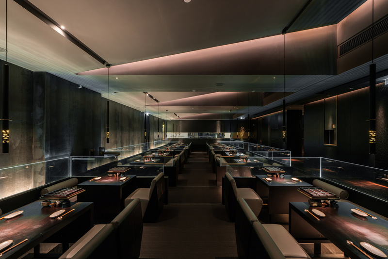
拾级而上,平面布局以平城京为参照,横平竖直,四刀分九块,流通简洁利落,通过地面边角的灯光将人缓缓引入情境之中。设计师着力于处理层高与大开间中场的空间尺度关系:抬高走廊区,并且合理降低客餐区桌椅高度,使下沉区的“静”与抬高区的“动”形成对比。
Up the steps, the plane layout is based on Pingchengjing, and the space structure is horizontal and vertical, as if nine pieces were cut with four knives. The circulation route is concise and neat, and people are slowly introduced into the situation through the lights in the corners of the ground. This designer focuses on dealing with the spatial scale relationship between floor height and large bay midfield: raising corridor area, and reasonably reducing table and chair height in guest dining area, so that the "static" of subsidence area is in contrast with the "dynamic" of elevation area.
另一方面,客餐区上空以一定坡度悬吊町屋式倾斜顶棚,弱化了低矮横梁对整体空间的压制,略有角度变化的坡面也为灯光效果提供了更强的可塑性。置身于此,静静地享受美食带来味蕾愉悦的同时,也令人放松心情忘却工作生活的烦恼,感受烟火气之下的安宁。
On the other hand, the inclined ceiling over the dining area weakens the suppression of low beams on the overall space, and the slopes with slightly changed angles also provide more plasticity for the lighting effect. In this place, while enjoying the delicious food quietly brings the taste bud pleasure, it also makes people relax and forget the troubles of work and life, and feel the tranquility under the smoke.
卡座背后透出的灯光在静谧的氛围中氤氲出清冽的奢华感,将客餐区切割为三个完全相同的体块,专注且精准,一如日本料理的严谨及匠心。
The light behind the cassette gives out the luxurious feeling in the quiet atmosphere. It cuts the guest dining area into three identical blocks, focusing and precise, just like the rigorous and ingenious Japanese cuisine.
远远望去,整个用餐区域宛若一个有序排列的道场,灯具是以武士刀造型为蓝本延伸而来,玻璃透出的光条像武士刀划过之后空气里留下的每个精准的瞬间。设计师借助实物与光影之间重叠的层次与模糊的边界,塑造虚实格局,创造出一个充满质感与深度的餐饮空间。
Looking from a distance, the whole dining area is like an orderly martial club. The lamps are based on the samurai knife. The light strips from the glass edge are like the precise moments left in the air after the samurai knife has passed. Designers create a dining space full of texture and depth with the help of overlapping levels and vague boundaries between physical objects and shadows.
日式料理给人的印象素来清寂,正如这个国家的美学基调一般,含蓄、淡泊、不张扬,沉浸着向内而生的深刻。本案打破了传统日料餐厅“日式和风”的呆板模式,简而不凡,素而不寡,每一处都有着独特的张力与韵味。
The impression of Japanese cuisine has always been calm and quiet, just like the aesthetic tone of this country, which is implicit, indifferent, unpretentious and immersed in the profound inward. This case breaks the rigid pattern of "Japanese style" in the traditional Japanese restaurant. It is simple and uncommon, with unique tension and charm everywhere.


